
Sunshine on a cloudy day
Ever had a room in your house that just...depresses you? That was our clients' kitchen. It was dark, brown, boxy, and small. For a young, smart, successful couple who loves to cook, this wouldn't do.
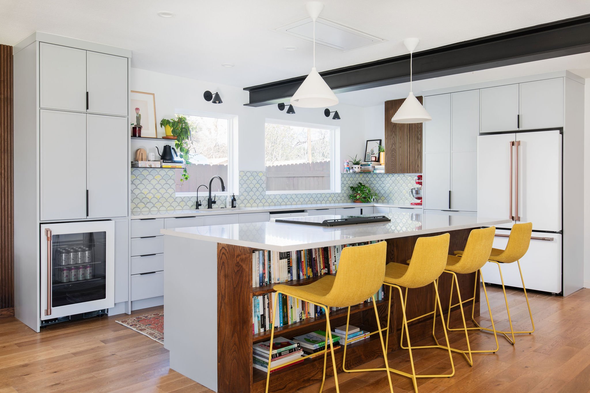
This remodel started with taking out a partial wall at the end of the island, which required adding a support beam across the middle of the house. Because of limited attic space, we had to lean into this being a design element, and opted for an exposed steel I-beam that is now one of our favorite features for its industrial feel. We added two large picture windows where there was only originally only one tiny window. And we pushed a wall back into the garage to square off and enlarge the entire space.
All the storage our clients need is incorporated into the dusty gray-blue cabinets, including the pantry and a coffee/hospitality station. New white appliances, scallop backsplash tile with a hint of acid yellow, and floating steel shelves give this kitchen a subtle, stunning sparkle.
We defined the dining room with striking comb siding, modern credenza, and commissioned art. New lighting and punchy paint in the window seat add even more character to weight this end of the space. As a finishing touch, our client had the great idea to repeat the comb siding in the kitchen with an upper cabinet next to the fridge.
The study was a challenge. It's smack in the middle of the house, but didn't have a clear definition. The traffic flow runs diagonally through it, from the entry to the kitchen/living room. We solved it by creating a studio with two zones: side-by-side desks as the main work-from-home zone, and a custom L-bench wrapped with floating shelves and cabinets as the loungey zone.
What was once a dead zone is now the functional heart of the home. It’s a hang-out, a creative hub, and an attraction that invites you to stay a while. It's at once airy and open, and cozy and productive, with plenty of open storage for books and plants, and clever closed storage for tech, office supplies, and jackets.
“It has completely transformed! We love and use the space every day. Before, it was unused and awkward and didn’t serve a purpose. Now, we’re in the room every day, reading, lounging, or doing work. There’s a purpose to it and it helps the flow of the house too - instead of being a sort of liminal space, we feel a lot more rooted here!”
We wrapped this project with a small bathroom remodel. The guest bathroom was lackluster with a twinge of claustrophobia. We ripped out a tower cabinet and replaced it with a custom vanity and wall-mounted toilet. We repeated the line-play from the dining room with a comb tile behind the vanity, linear straight-stack tile in the tub surround, and an over-sized penny tile on the floor. The tile, color, and lighting add up to big personality in a petite space.